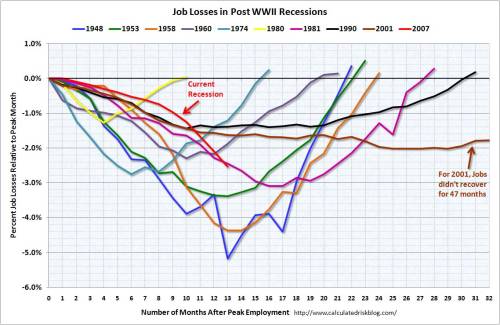
I came across this graph that compares US job losses in the current recession to losses in previous recessions.
- The graph shows losses as a percentage of the peak
- The current recession has already seen more jobs lost than the 2001 recession
- Employment statistics are notoriously sneaky. For instance over the years the definitions have changed so comparisons are tough
- It looks like the current recession is going to be a biggy
