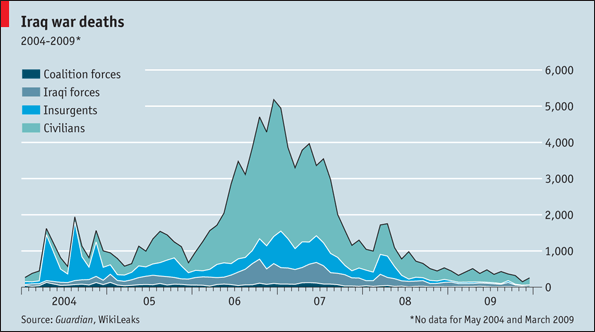
The Economist has put up this graph showing who is doing the dying in Iraq. The graph is interesting not only for its content but also because of the data source.
Firstly, the graph shows that by far the biggest victims of the ongoing violence in Iraq are civilians. Especially around 2006 and 2007 far more civilians were dying than combatants.
The source of the data is also interesting. Wikileaks is a website dedicated to whistleblowing. They allow anonymous posting of any sensitive information. Somehow Wikileaks got hold of 400,000 reports from the US military.
The graph above comes from those reports. So this is the US military’s own data.