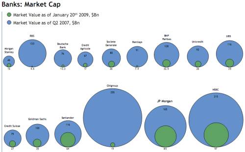
UPDATE: A friend pointed out that this illustration is in fact a dishonest misrepresentation of the figures. If it really is from Bloomberg then I am shocked!
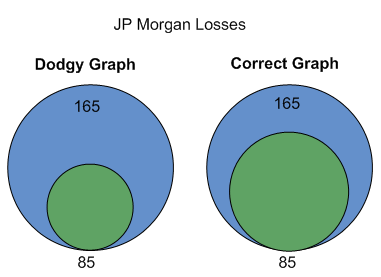
He noticed that the illustration uses the diameter of the circles to illustrate the relative market caps. In other words the height of each circle represents the market cap – not the area (size) of the circle.
This is a problem because we naturally compare the sizes (areas) of the circles. However, if you double the height of a circle you actually increase the area of the circle four times!
To see what I mean consider the graph below of the shrink in JP Morgan’s market cap. On the left is the original graph with diameter representing market cap. On the right is the correct graph showing market cap as area.
This shows clearly why the original graph is so shockingly bad. Could be a mistake, but I doubt it.

I recently received this graphic view of the massive shrinks in the market caps of major global banks. The source is supposedly J.P. Morgan via Bloomberg, but I can’t vouch for its accuracy.
Click for a larger version.
