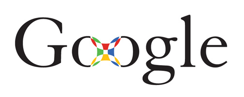
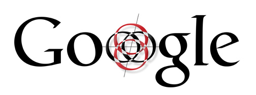
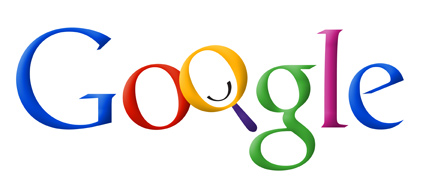
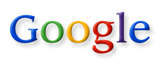
Wired has this gallery showing the prototype logos that were developed for Google in the early days. Ruth Kedar is a graphic designer who was working at Stanford University at the time and she “had no idea at the time that Google would become as ubiquitous as it is today, or that their success would be of such magnitude.”
The actually gallery has quite a lot of descriptive text – this is from the final version of the logo:
“There were a lot of different color iterations. We ended up with the primary colors, but instead of having the pattern go in order, we put a secondary color on the L, which brought back the idea that Google doesn’t follow the rules.”
Here are some of the iterations on the logo that we now all know so well.


