Tag Archives: graph

Analysis of Human Development Index for South Africa

The UN’s Human Development Index is an attempt to quantify quality of life. Three measures are used to create a single human development score:

  • Health (life expectancy)
  • Education (adult literacy)
  • Wealth (GDP per capita)

Using only three variables makes comparison possible, but it does mean that the HDI is pretty crude.

It still makes interesting reading.

The latest report (with data for 2007) has just been released. Norway comes out on top followed closely by Australia.

South Africa comes in at 129th of the 183 countries (some really bad places like Somalia and Zimbabwe don’t have enough data to be on the list at all).

hdi-south-africa-relative

I was particularly interested in the trends over time. South Africa has gained ground since 1980 but has fallen off since a peak in 1990.

hdi-south-africa-overall

Looking at each of the components in HDI it becomes clear that life expectancy is hurting South Africa’s HDI score. AIDS is really holding us back. GDP per capita has also been pretty flat.

hdi-south-africa-components

How has South Africa done relative to similar countries? Let’s compare SA to the 26 countries with the closest HDI scores back in 2000.

Not pretty. As you can see we’ve been in free fall. We went from the middle of this little group to stone last!

hdi-south-africa-same-starting

What about similar countries by geography? Let’s compare SA to our regional neighbors. Clearly our region is struggling, but SA has still lost two places!

hda-south-africa-regional

Graph comparing job losses in US recessions

I came across this graph that compares US job losses in the current recession to losses in previous recessions.

  • The graph shows losses as a percentage of the peak
  • The current recession has already seen more jobs lost than the 2001 recession
  • Employment statistics are notoriously sneaky. For instance over the years the definitions have changed so comparisons are tough
  • It looks like the current recession is going to be a biggy

Job loss comparison graph

More shocking evolution stats

Numbers like those represented in this graph from The Economist upset me badly. The fact that only about 40% of Americans believe evolution is true is just horrific!

Anyone who knows anything about evolution (it is so fundamental that it should be taught in primary school) should see evolution for what it is – obviously true.

Evolution is so mind-blowingly obvious that I’m often surprised when intelligent friends refute it. I’ve gone to great lengths to understand how intelligent people who are not ignorant of the details can still argue against evolution.

Religion.

These guys and girls are so desperate to hold onto something that they reject something as fundamental and as obvious as evolution…

Graph showing belief in evolution by country

Wind power is taking off

Despite my own misgivings about wind power it seems to be taking off globally. This is a good thing – the more clean energy the better. I am still not convinced that wind is the ultimate solution, but it certainly does help.

This graph and excerpt from The Economist shows that global wind power production is climbing exponentially. Also, USA has now become the largest wind power producer in the world.

Economist graph showing wind production increasing

Visualization of the credit crunch eating banks

UPDATE: A friend pointed out that this illustration is in fact a dishonest misrepresentation of the figures. If it really is from Bloomberg then I am shocked!

He noticed that the illustration uses the diameter of the circles to illustrate the relative market caps. In other words the height of each circle represents the market cap – not the area (size) of the circle.

This is a problem because we naturally compare the sizes (areas) of the circles. However, if you double the height of a circle you actually increase the area of the circle four times!

To see what I mean consider the graph below of the shrink in JP Morgan’s market cap. On the left is the original graph with diameter representing market cap. On the right is the correct graph showing market cap as area.

This shows clearly why the original graph is so shockingly bad. Could be a mistake, but I doubt it.

showing-the-effect

I recently received this graphic view of the massive shrinks in the market caps of major global banks. The source is supposedly J.P. Morgan via Bloomberg, but I can’t vouch for its accuracy.

Click for a larger version.

banks-market-cap-thumb

Great flowchart of the financial crisis

Everyone knows that there is a financial crisis – very few people understand what is going on or what happened. This is a really good flowchart that helps to explain things in what I think is a simple way.

I highly recommend clicking through and spending 5 minutes reading the flowchart. It’s well worth it.

Financial crisis flowchart

Click through to read this great flowchart outlining the story behind the financial crisis. Excellent stuff.

South Africa’s road network is being allowed to fall apart

South Africa's road networks are falling apart
South Africa has huge backlogs on required roads maintenance. However, the currently allocated money is nowhere near meeting the needs. That means that we are falling further and further behind and unless something really drastic is done our roads will be as bad as our electricity.

Infrastructure is a tricky thing for politicians. It costs a lot to build and maintain infrastructure, but it’s normally one of those things that you don’t notice till it’s gone. Stupid politicians often don’t bother with infrastructure which won’t be noticed for years when they can use the money to win votes now.

That, to the dismay of many, has been happening in South Africa for a while. In 1994 the ANC took over and they did a great job as a transitional government – South Africa got through that little part of history wonderfully. But anyone who reads this blog will know that I think the ANC are rubbish at governing a running country.

One of the things that the ANC are worst at is maintaining our national infrastructure. So we are already in deep trouble with electricity, our rail networks are nowhere near what they should be, and our roads are falling apart.

Jeff Radebe (Transport Minister) has just released information (after being hounded by the DA) on just how bad things are with our roads – see the graph above. Basically he said that we are miles behind on road maintenance and that at current rates we will never catch up. In other words unless something drastic is done South Africa’s road network will completely collapse!

One of South Africa’s biggest problems is that the ANC can do anything without worrying about the results of the next election. They are a terrible government largely because they don’t have to worry. I wish that there was a possibility of them losing an election.

From The Economist to lightning balls to 1930s comics to World War 2 fighter pilots to UFOs to Dave Grohl to the Foo Fighters

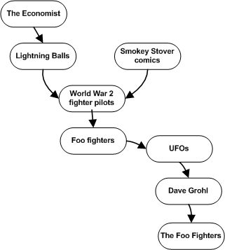
I recently read an unusual article in The Economist about a controversial phenomenon known as ball lightning. Basically ball lightning is a rare and unpredictable phenomenon where lightning forms a glowing ball which can persist and move around for several seconds rather than the normal flash.

Ball lightning appears to be inconsistent in color (pale blue, yellow, green, red and white), size (pea sized to several meters) and behavior (dropping form the sky, moving along the ground, and sometimes nailing people).

Yeah it sounds like bull, but they have been seen thousands of times by thousands of witnesses over the last few centuries. Several scientific groups are working on explaining ball lightning. Hell, even The Economist (normally very skeptical) has written a detailed article about the studies attempting to explain them.

Wikipedia has a detailed article on lightning balls which mentions that they were often sighted by fighter pilots during World War 2. Now we need a little aside: early in the war poorly trained Japanese pilots often flew erratic trajectories and the Allied pilots developed a derogatory term for them – foo fighters. The name came from a comic strip popular at the time, Smokey Stover, which often made use of the nonsense word foo.

So when the pilots repeatedly saw the erratically moving balls of fire they became known as foo fighters. Because lightning balls (foo fighters) were/are largely unexplained a lot of people think that they are UFOs (rubbish). Someone who is fascinated by UFOs is Dave Grohl who therefore chose the name for his band the Foo Fighters.

It’s like the whole 6 degrees idea but for concepts instead of people. Awesome.

Birthday graphs

Today is my birthday – an event that is becoming increasingly scary! Quarter century down…

Anyway, graphs always cheer me up so here we go:

From today I am closer to 30 than 20!

From today I am closer to 30 than 20 years old

But I still have 1 year to publish a paper like Einstein’s relativity or 21 years to beat Obama to a presidential nomination!
My age relative to a few other things