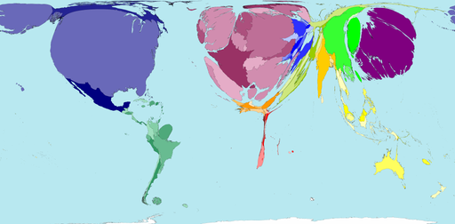
 I just came across a cool site called World Mapper which generates statistical maps of the world. They warp the sizes of countries to show relative statistics. For instance the image on the left (click for full size) shows world GDP (at purchasing parity). As you can see countries in the northern hemisphere are a lotter richer than us in the south. Most of Africa has all but disappeared in this view! Also have a look at the size of Japan!
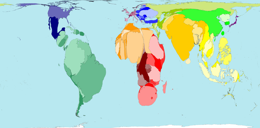
Africa is a lot more prominent in the next map. Unfortunately that’s because it shows relative homicide rates (murder and manslaugther but excluding war). And look at South Africa – a fat blob even compared to the rest of Africa!
Pingback: South Africa has a GDP roughly the same as Wisconsin | alistair.pott()